The Psychology of Color in Digital Design
Color is one of the most powerful tools in digital design. It influences how users feel, behave, and even make decisions. Understanding the psychology of color helps designers create interfaces that not only look beautiful but also communicate effectively and build emotional connections.
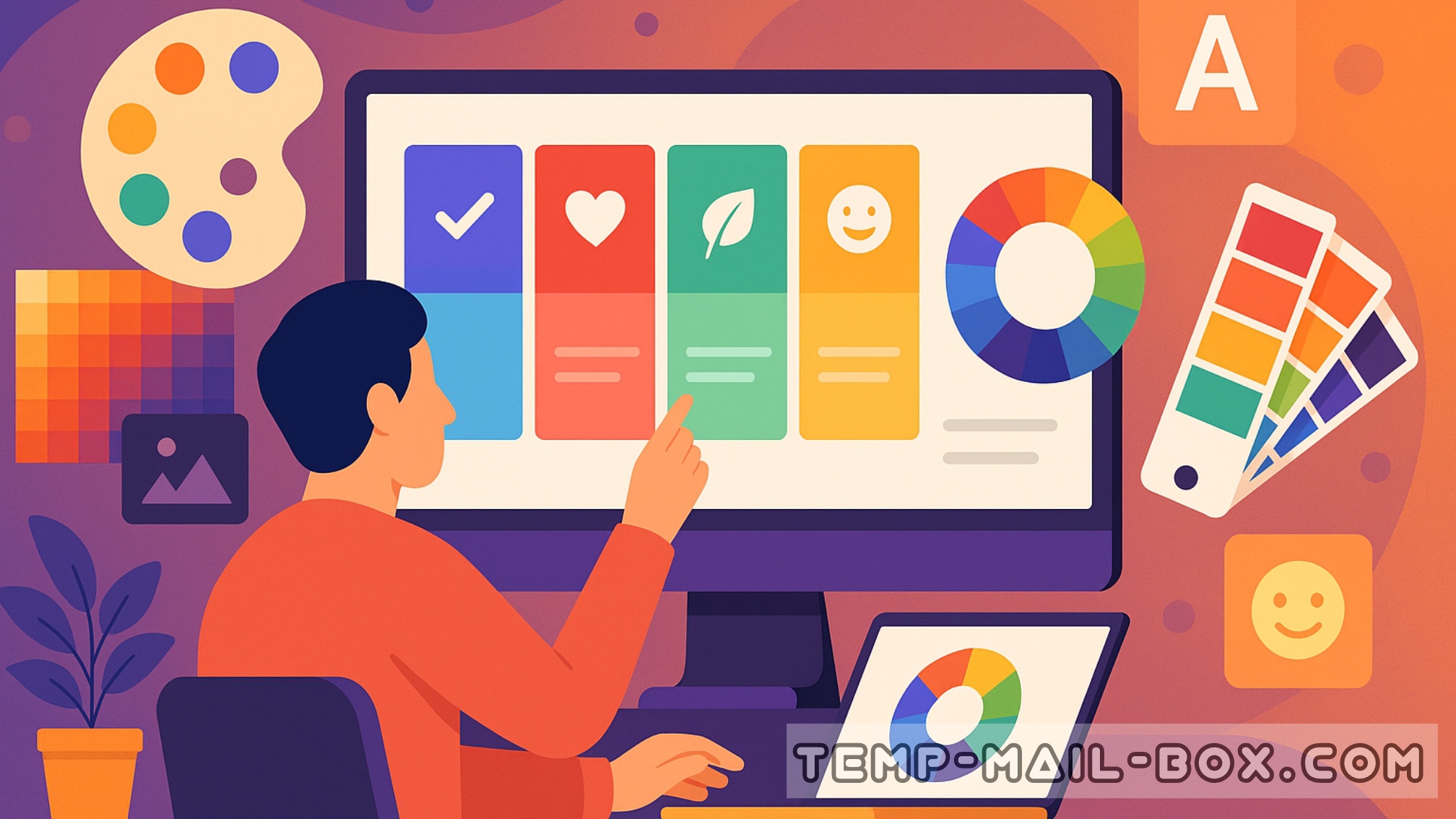
Every color carries psychological associations that can trigger specific feelings. For example, blue is often linked with trust, reliability, and calmness — that’s why it’s so common among tech companies and financial institutions. Red, on the other hand, is energetic and urgent; it grabs attention, making it ideal for calls to action or promotions. Green symbolizes balance, health, and growth, while yellow evokes optimism and friendliness.
In digital design, the choice of color affects user experience (UX) on multiple levels. Bright, saturated hues can energize users, but too many may cause visual fatigue. Soft or muted palettes, in contrast, create a more relaxed atmosphere but may lack emphasis if overused. The key is balance — ensuring that colors support the hierarchy, readability, and emotional tone of the product.
Color also plays a vital role in branding. People often associate specific shades with certain brands — think of Coca-Cola’s red, Facebook’s blue, or Spotify’s green. These colors go beyond decoration; they create recognition and trust. In digital interfaces, consistent color usage helps maintain brand identity across apps, websites, and marketing materials.
Another important aspect is cultural perception. The meaning of color can vary across countries and audiences. While white symbolizes purity in Western cultures, in some Asian traditions it represents mourning. Designers creating global products must consider these nuances to avoid misunderstandings.
Modern digital tools and A/B testing make it easier than ever to study how colors influence conversions and engagement. Designers can test different shades for buttons, backgrounds, or icons to see which version leads to more clicks or better retention.
Ultimately, mastering color psychology means understanding both art and science. Colors shape our emotions and actions subconsciously, so when used wisely, they transform ordinary interfaces into memorable experiences.